• Skip to primary navigation
  • Skip to main content

Rachel Gabay

  • Home
  • About
  • Process
  • Portfolio
  • Contact
  • About
  • Process
  • Portfolio
  • Contact

Axela Kitchens

Axela: Industrial Kitchens

The Brand

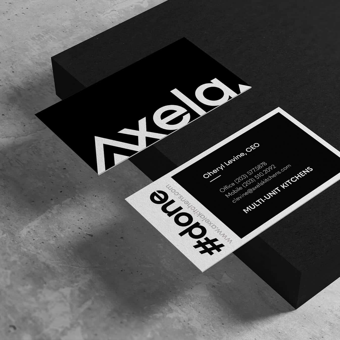
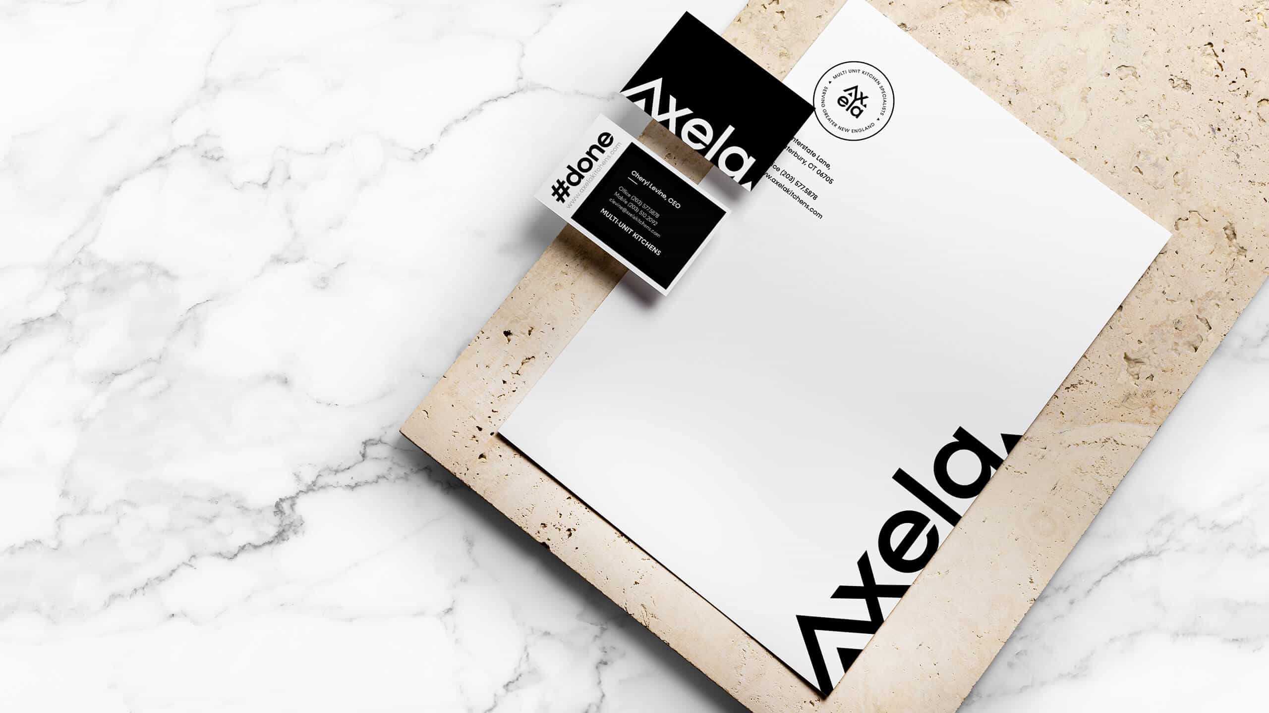
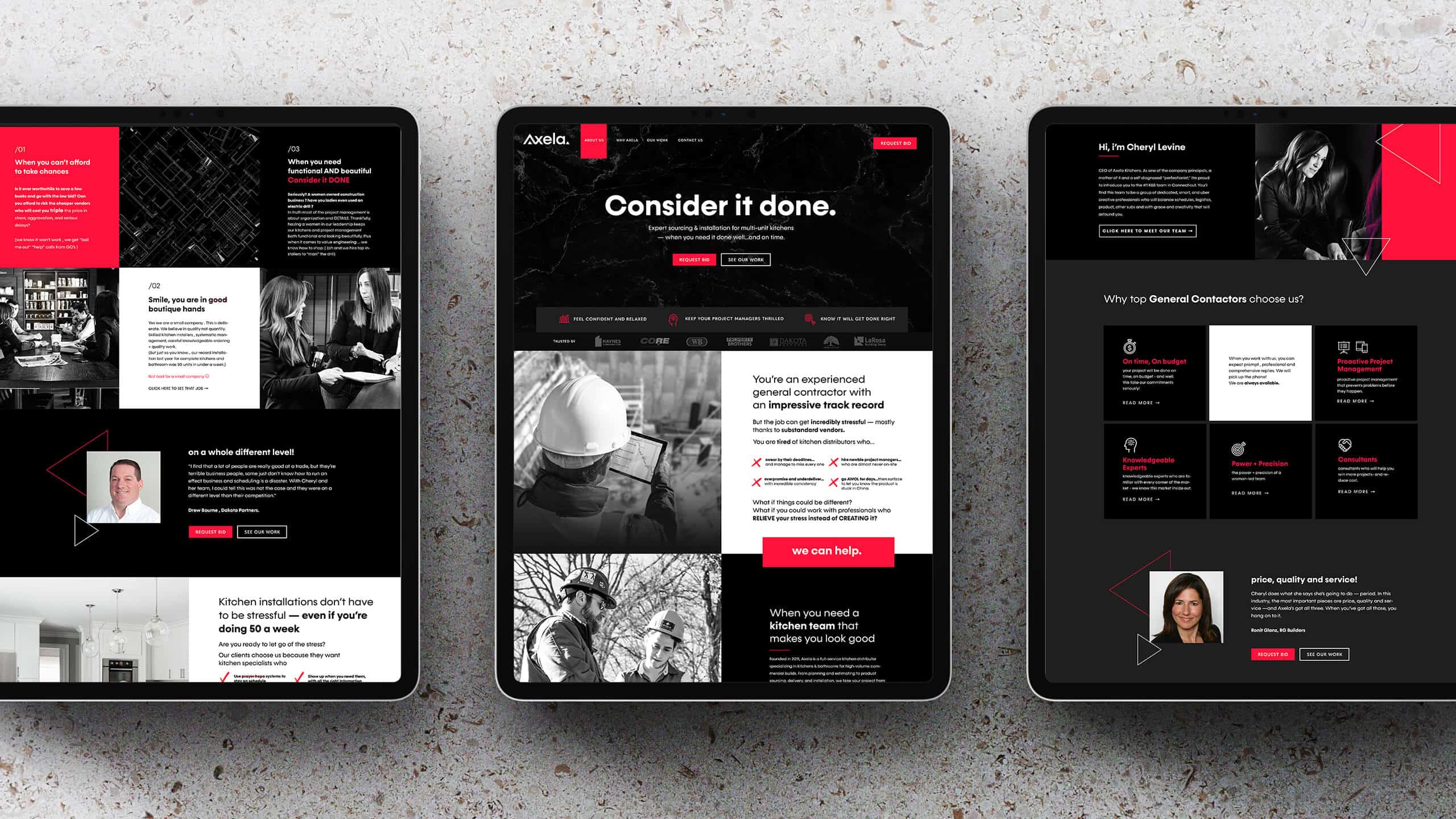
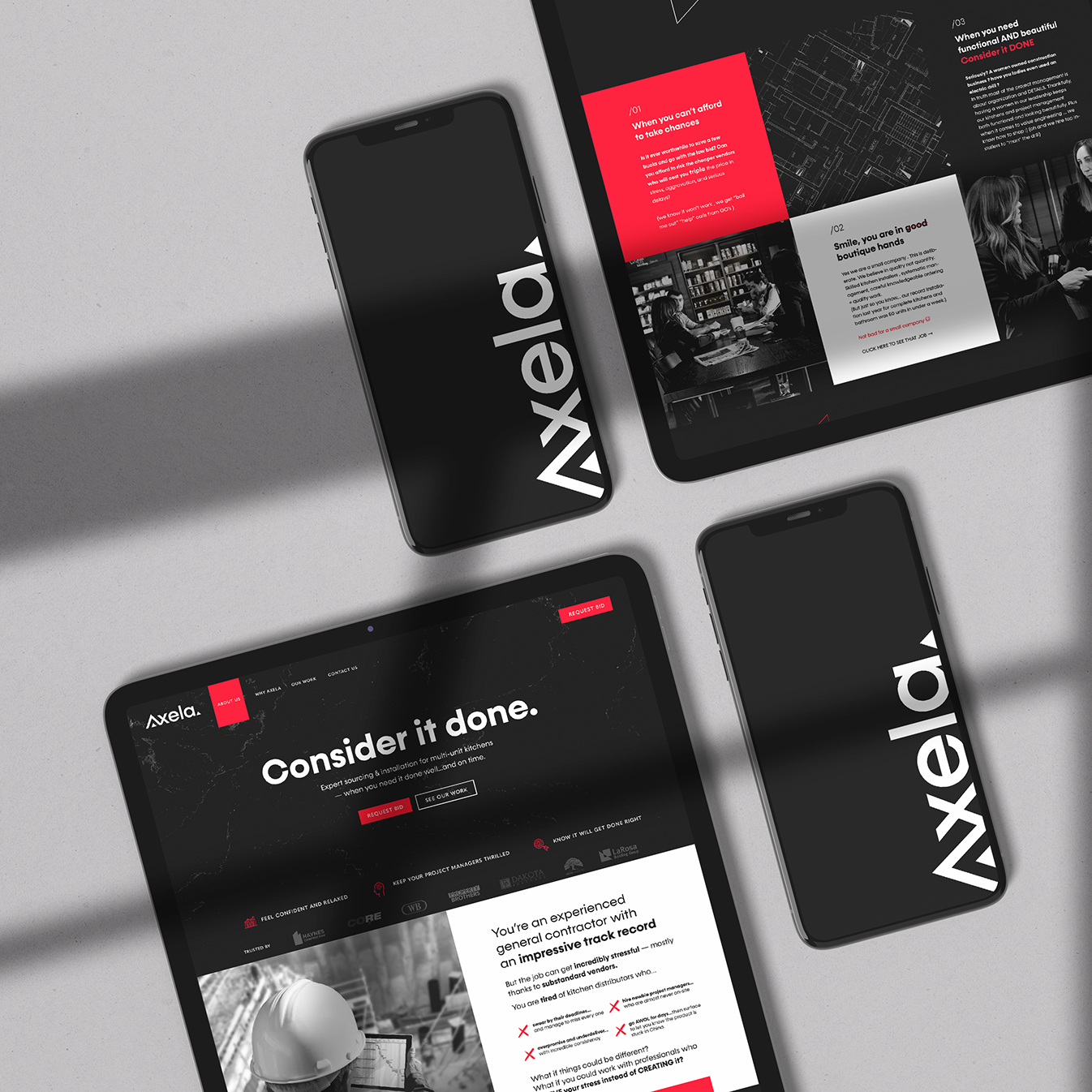
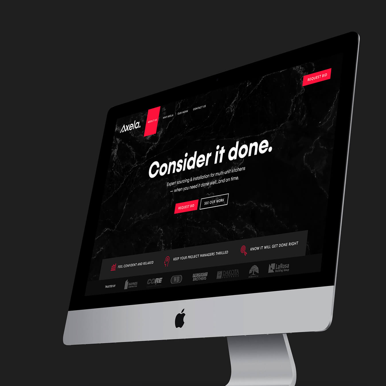
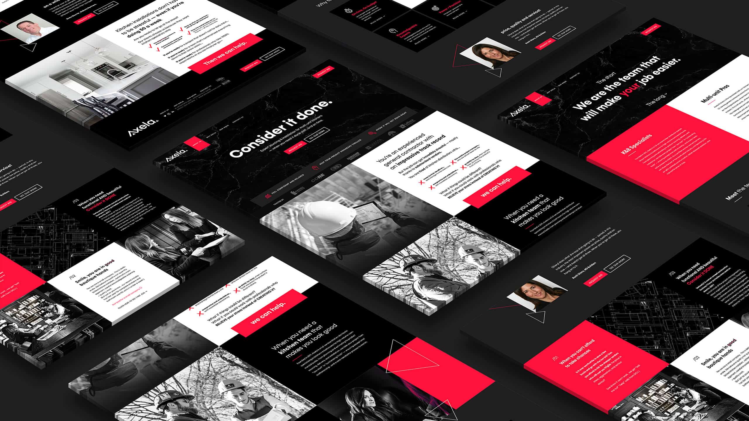
Axela is an industrial kitchen company. They design, fit and sell multi-unit kitchens.

The Challenge

To visually reflect Axela’s core brand differentiators: “We’re an exceptional, reliable, efficient service. Trust us.”

The Result

This logo’s shaped like an A and an arrow. The bold color palette, sharp edges, and strong lines shout, “We get the job done to a tee.”

Victoria Bell Design

Victoria Bell Interior Design

The Brand

Victoria is a meticulous, high-end interior designer, offering a friendly and personal service.

The Challenge

Victoria designs homes that are timeless. She wanted her branding to say: “You want classic, but not old-fashioned. Modern, but not funky. That’s me.”

The Result

The logo is made from ‘V’s (for Victoria) using a traditional serif font. Like her work, her branding is classy, sophisticated, and won’t be out of date anytime soon!

Novamind

Novamind

The Brand

Novamind is a legal, medically approved, evidence-based psychedelic treatment.

The Challenge

Novamind needed a strong, trust-inspiring logo that said, “This is safe and science-backed. (And hey, it’s natural too!)”

The Result

The symmetrical, clean, and bold logo is shaped like a brain with leaves inside. This product may be natural, but it’s obvious that it’s not woo-woo.

Beth Hamidrash Synagogue

Beth Hamidrash Synagogue

The Brand

This is a diverse and warm Sephardic synagogue. Their old branding was outdated. It was time for a modern look to attract the younger crew.

The Challenge

To strike a visual balance between ancient and modern, speaking both to the older synagogue-goers and the younger, more casual crowd.

The Result

The logo is a jazzed up version of a traditional Moroccan lantern. The patterns, colors, and ornate swirls reflect the richness and warmth of Sephardic culture.

Seruya

Seruya:
Christmas Beauty Gift Guide

The Brand

This leading perfume and cosmetics retailer is the “Sephora of Gibraltar.” They were putting out their annual holiday gift guide.

The Challenge

To design a jaw-dropping gift guide full of tra-la-la that would entice shoppers to engage — and buy!

The Result

Bold colors and eye-catching fonts create an easy-to-read, festive experience. The magazine’s compelling layout makes the products sparkle and shine.

Stems

Stems: Flowers and Chocolates

The Brand

Stems is a high-quality flower and chocolate gift shop in Gateshead, UK. They specialize in flower arrangements for events and boutique gifts.

The Challenge

To show customers that this is not a run-of-the-mill gift store. They carry a premium line of products (at premium prices).

The Result

I hand-drew custom, vintage swirls and used a classic black and white color scheme to create an elegant and sophisticated logo.

Tutto Frutto

Tutto Frutto:

Nurturing Nuggets

The Brand

Tutto Frutto needed packaging for “Nurturing Nuggets” — a product line that is nutritious, delicious and FUN!

The Challenge

To turn healthy snacking into a fun and friendly alternative, for both health-conscious adults and taste-conscious children.

The Result

The faded earthy fonts create an organic look. The bright colors and playful illustrations contrast with the background so this package shouts EAT ME!

Baby Dreams

Baby Dreams:

Distinctive Tiny Classics

The Brand

This is an upscale babywear store. Their personal connection with their customers and hand-picked collection makes them unique.

The Challenge

To pair sophistication with playfulness and create something that communicated “baby” but not “babyish.”

The Result

Instead of baby pink and pacifiers, I hand-sketched a rocking-horse logo. The soft but atypical colors paired with blocks and typography create a classy, trendy look.

logo that links to homepage
  • About
  • Process
  • Home
  • Portfolio
  • Contact